.png)

During guerrilla usability testing, I noticed 2 things: users initially would select the wrong campsites and users needed to have a destination to be successful. I noticed users expressing frustration when they ran into either blocker and challenged myself to redesign the flow to reduce friction for users planning a camping trip.
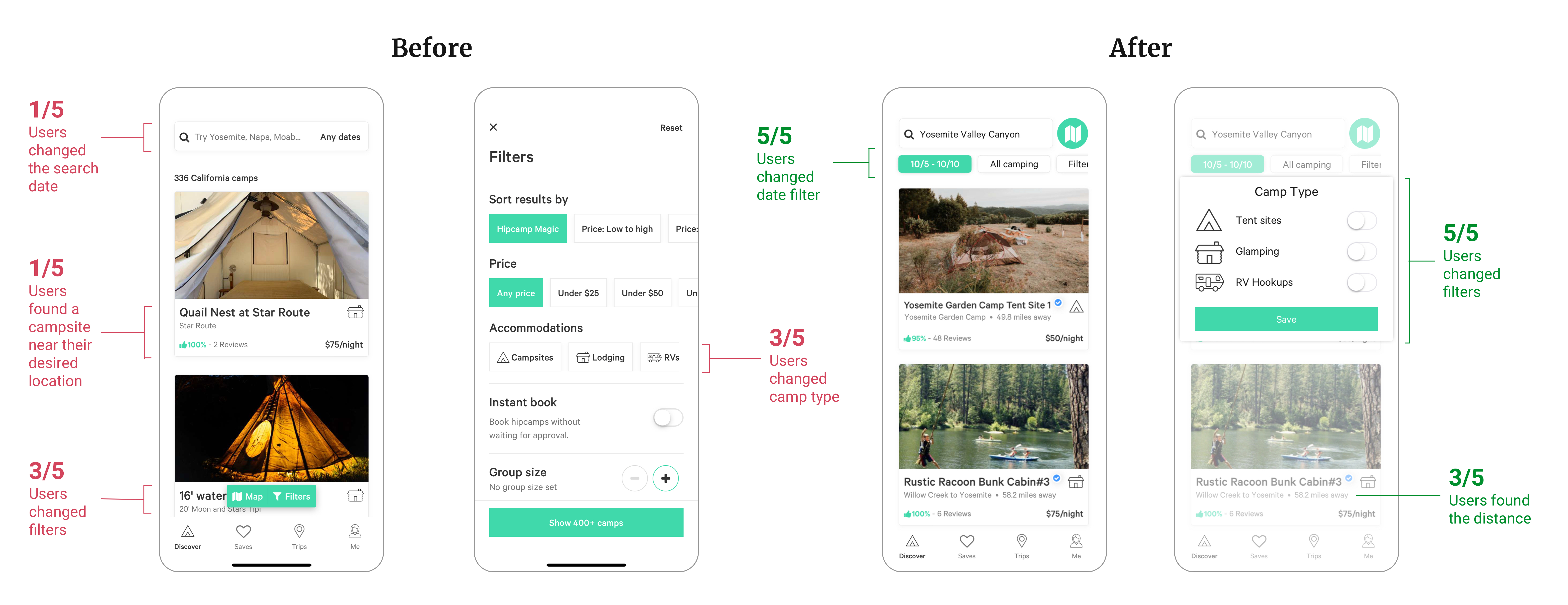
I made changes to the UI and optimized the placement and look of the filter buttons to reduce user error by 60% during the campsite selection process.
I read reviews, ran guerrilla usability testing, and analyzed competitor, with that, I found common pain points that users faced. I sought out to focus on 2 pain points and design solutions that would simplify the campsite booking process. The final screens below were thoughtfully designed after multiple sketch iterations and validation tests.


I made changes to the UI and optimized the placement and look of the filter buttons to reduce user error by 60% during the campsite selection process.
I made changes to the UI and optimized the placement and look of the filter buttons to reduce user error by 60% during the campsite selection process.
I made changes to the UI and optimized the placement and look of the filter buttons to reduce user error by 60% during the campsite selection process.
I made changes to the UI and optimized the placement and look of the filter buttons to reduce user error by 60% during the campsite selection process.
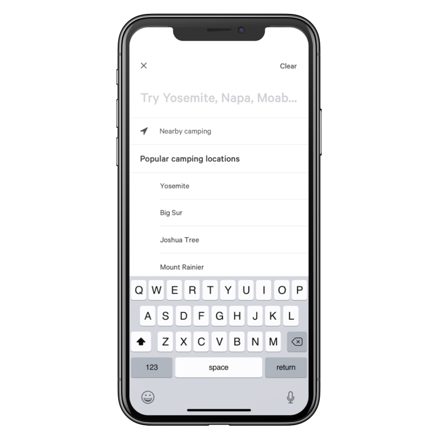
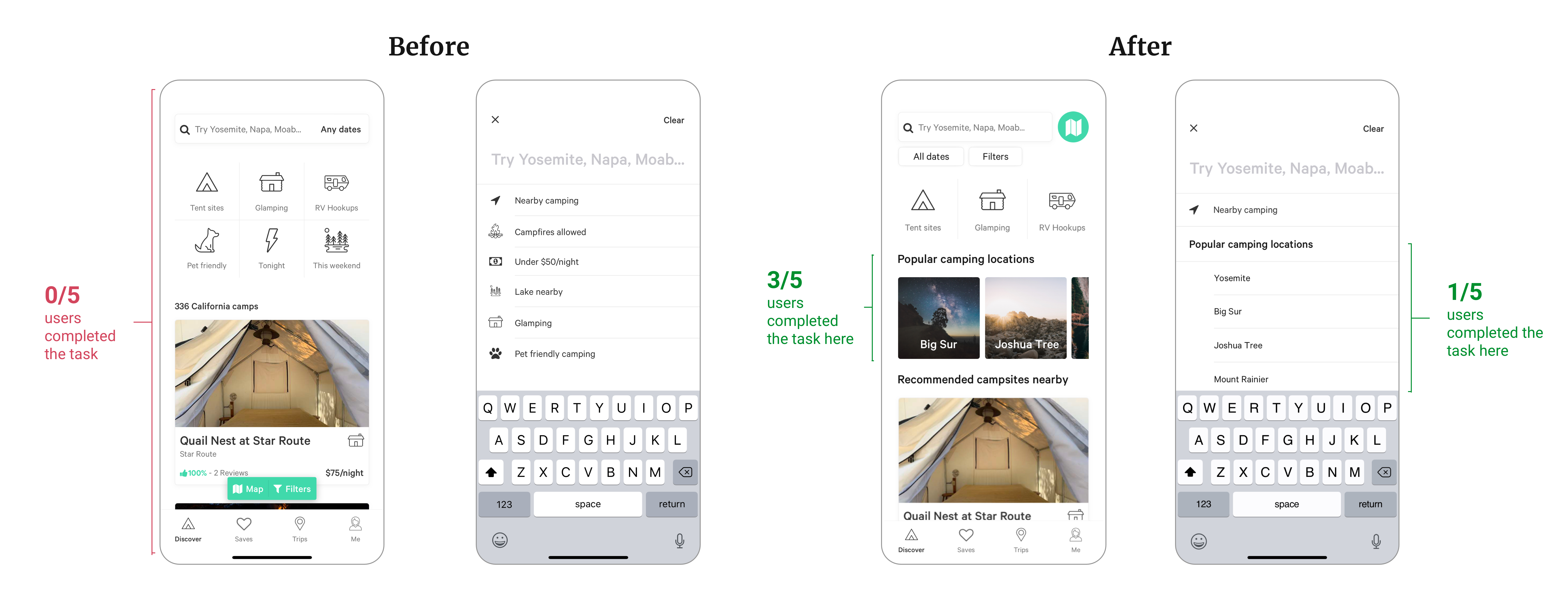
Users are currently expected to have a destination in mind when opening the Hipcamp app.
.png)
Users are currently expected to have a destination in mind when opening the Hipcamp app.
Users are currently expected to have a destination in mind when opening the Hipcamp app.

Users are currently expected to have a destination in mind when opening the Hipcamp app.
Users spend valuable time and energy searching for the right campsite. Oftentimes, they scroll through a series of listings that don't fit their camping requirements.

During the usability tests, users had difficulty identifying the filter buttons (filter and add dates). In the lo-fi phase of designing a solution, I tested different options that focused on the idea of bringing the buttons together in a cohesive matter with design similarities to associate the actions and task flow. In the end, I designed the buttons below the location search bar to bring higher visibility to the important actions.
Finally, 1/5 users selected a campsite near their desired location. In an effort to bring emphasize transparency and accuracy using design, I added a "distance away" metric on the listing card.

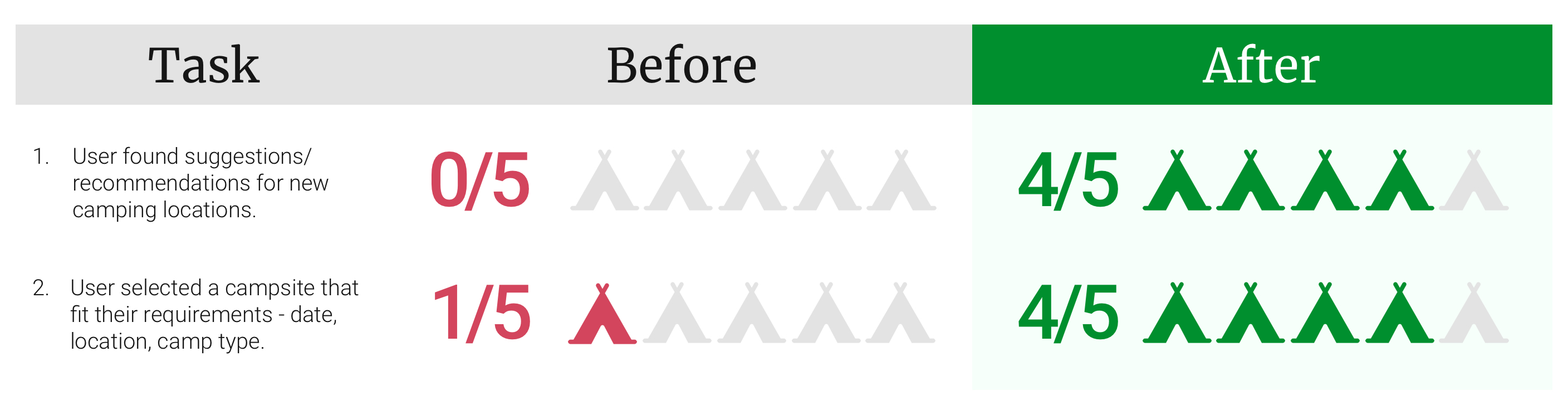
I conducted 5 validation tests and asked users to complete tasks with a clickable prototype. These tasks mirrored the tasks used in my original guerrilla usability test.
At the beginning of the 2-week sprint, I challenged myself to improve a design that is already built functionally with the user in mind. Through usability testing, I found changes to the UI that could vastly improve the user experience and provide another layer of user-centric design.
I sought out to simplify and streamline the campsite booking experience.
Dedicate more time for researching and planning.
In a short 2-week sprint, I initially sped through the research and planning user tasks phase. After a few initial tests, I saw this as a flaw within my strategy. I chose to pause, revisit, and pivot towards a different strategy to understand what users were truly having an issue with.
A quick validation test before a clickable prototype saved my life.
Designing just enough to validate your designs quickly. Early feedback from users can steer you quickly towards the solution. This method saved me a huge chunk of time right before I devoted time and energy into building my clickable prototype.