HeyDoctor
Improving service discoverability
HeyDoctor
HeyDoctor
project overview
Improving service discovery for patients
Company
HeyDoctor provides easy, affordable, and secure online medical visits.
Device
Mobile and desktop web
Team
Product designer (me)
Software engineer
Product manager
the problem
Messaging inefficiency extends visit length
HeyDoctor's inefficient EMR messaging system slowed down doctors when they were communicating with patients.
the solution
Implementation of common symbol notations
I built upon our foundational messaging system to create a familiar pattern that doctors had used in other EMRs to improve the typing experience.
the problem
Patients had to scroll through a list of 36 services
At HeyDoctor, we grew our services from a few to 36 (and increasing...) without any categorizing. In user interviews, we talked to patients who needed services that we offered, but they weren't even aware it existed.
goals
Simplify the list of services available
1. Categorize the services list
2. Improve visits started rate from the services page
final designs
6 categories that encompass our services
The categories included the services that we have now, but they will also fit our future services on the roadmap.
final screens
Multi-phased implementation
enter text
research
Multiple unmoderated research studies through UserZoom to name categories and validate them
I shadowed 5 doctors specific to this project, but generally, I shadow 2 new doctors weekly. Within each session, I watched doctors treat different service types and difficulty levels.
Open card sorting study
Closed card sorting study
Usability testing
design
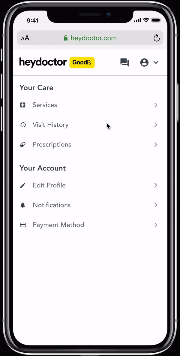
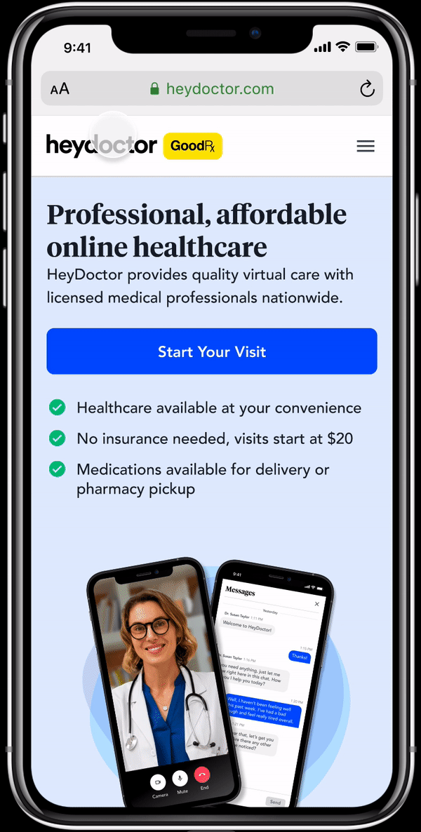
Improving service discovery on the homepage and logged-in experience
Previously, both experiences led users to a long, uncategorized list of 36 different services. The overall experience led to patients not fully aware of all the services that we do offer that might pertain to their healthcare needs.
I shadowed 5 doctors specific to this project, but generally, I shadow 2 new doctors weekly. Within each session, I watched doctors treat different service types and difficulty levels.
Before
Without selecting a specific visit type yet, they have to scroll through a list of 36 services to find the one they are looking for.
After: Homepage Dropdown
From the homepage menu, patients can click services and see a list of services categorized. I made sure to provide enough space between services on mobile, because fat finger is a thing!
After: Logged-in Services Page
Patients land on the logged-in services page after they sign up or sign in. From there, they can exploree categories to find the service that fits their needs.
Categories Hub on Homepage
In the initial version, we are tracking snippet usage by doctor and by service type to implement suggestions in the v2 release.

This will help part-time doctors easily access the most common snippets without having to search for it each time.
next steps
Replace gender-based categories with new categories on the homepage redesign
Now that we are in development with the dropdown menu and services page, we can work on redesigning the categories section on the homepage. Currently, we still have the gendered categories on the homepage but this redesign aligns with our current efforts to redo the homepage.
learnings
More time to run usability tests
Add more time to run a final usability test with final designs. There's still a chance I can run the test as this is only beginning development, but it's always better to run testing prior to getting to engineering.