Helping market researchers make smarter business decisions.
project overview
Designed a dashboard for market researchers
Company
Craft.co maps the global economy and delivers intelligence on companies to corporate decision-makers globally.
Role
Lead product designer focused on both research and design (team of 5)
Skills
User research/testing UI design Data visualization Prototyping
Timeline
6-week sprint
the problem
Fragmented data sources leads to missed opportunities for market researchers
Misinformed business decisions and missed opportunities can occur when market researchers are not properly informed of changes in the market. From user research, current market researchers use two or more sources to find out valuable information about both public and private companies that they follow.
Current market researchers use two or more sources to find out valuable information about other companies that they follow.
the solution
Visualizing all actionable data that users value
I designed a dashboard that tracks all the companies a user follows by prioritizing information used to make business decisions and alert users of recent updates.
• • •
final deliverable
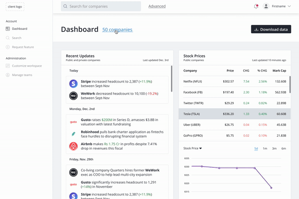
Prioritized content into a single dashboard
The primary goal of the dashboard was to provide market researchers with actionable insights that allowed them to react to changes in the market.
Added awareness
Included the total number of companies each user follows.
Prioritized content
Moved the 'Recent Updates' card to the 1st position on the left side.
Reduced cognitive overload
Prioritized the top 5 companies with the highest percentage change.
Built trust with users
Increased users' trust in the data provided by adding source and 'last updated' timestamp.
• • •
research
There's no all-in-one solution in the market
To understand what we were solving for, I researched competitor products and interviewed 5 people within our persona. After conducting user interviews, I identified the top 4 findings to drive design decisions that met both the users' needs and Craft's business goal.
user interviews
A recent update can spark a vital business decision
One major takeaway from this project — interview more users.
I initially relied too heavily on client-provided information and market research. In the process of wireframing, I realized I was designing “in the dark.” I hadn’t understood the user and their needs as much as I had considered the business goals.
Within 2 business days, I interviewed 5 people within our target persona — corporate/business development, equity investment analyst, and investment banking. Essentially, people who tracked multiple companies to make business decisions.
These interviews yielded immensely valuable information that the client had not discovered yet. I used a spreadsheet to analyze and track responses by interviewee and question. This led to a more organized and efficient affinity mapping session and a list of prioritized findings.
top 4 findings prioritized
Findings based on 5 user interviews
1
Market researchers want to immediately see recent updates and changes from companies they follow.
2
Market researchers use multiple sources to collect information about companies.
3
Market researchers follow 10+ companies at a time.
4
Eventually, market researchers unfollow companies when the company no longer fits business needs.
People want to see recent updates and changes immediately about companies they follow — Craft's initial hypothesis validated
Market researchers use multiple sources to collect information about companies
People follow 10+ companies at a time
Eventually, people unfollow companies when they no longer fit the needs of the business
user interviews
A recent update can spark a vital business decision
One major takeaway from this project — interview more users.
I initially relied too heavily on client-provided information and market research. In the process of wireframing, I realized I was designing “in the dark.” I hadn’t understood the user and their needs as much as I had considered the business goals.
Within 2 business days, I interviewed 5 people within our target persona — corporate/business development, equity investment analyst, and investment banking. Essentially, people who tracked multiple companies to make business decisions.
These interviews yielded immensely valuable information that the client had not discovered yet. I used a spreadsheet to analyze and track responses by interviewee and question. This led to a more organized and efficient affinity mapping session and a list of prioritized findings.
user flow
Users can add/unfollow companies from the dashboard
The user needs to control certain aspects of the dashboard in order to analyze actionable insights that affect their company. For V1 of this product, the client wanted to focus on a more one-size fits all type of solution. In later versions, they would be able to implement a customizable dashboard that allows users to move cards around and dictate the metrics seen. For now, I would focus solely on a V1 dashboard that allowed users to control the companies that they see through following and unfollowing.
To populate the dashboard, the user has 2 options:
During onboarding, the user adds companies to follow by searching
In the dashboard, the user can find companies to follow through the top search bar
To unfollow companies, the user also has 2 options:
On the top of the dashboard, the user can click the 'X companies' text link to unfollow one or more companies that they no longer wish to follow
In the cards, the user can right-click the company name in the legend to unfollow
• • •
• • •
design
Two design challenges
Public and private companies can either be on one individual dashboard or separate dashboards
The visualization of data and prioritization of multiple companies on a graph.
user interviews
A recent update can spark a vital business decision
One major takeaway from this project — interview more users.
I initially relied too heavily on client-provided information and market research. In the process of wireframing, I realized I was designing “in the dark.” I hadn’t understood the user and their needs as much as I had considered the business goals.
Within 2 business days, I interviewed 5 people within our target persona — corporate/business development, equity investment analyst, and investment banking. Essentially, people who tracked multiple companies to make business decisions.
These interviews yielded immensely valuable information that the client had not discovered yet. I used a spreadsheet to analyze and track responses by interviewee and question. This led to a more organized and efficient affinity mapping session and a list of prioritized findings.
dashboard design
Iterating and testing the dashboard design
I explored two options for the presentation of public and private companies. I settled on the following two dashboard designs and referred back to user interviews to determining the best solution for users.
#1: Two dashboards
I separated public and private companies, this distinguishes data between the two types.
#2: One dashboard
This centralizes all the companies that a user follows and removes the friction between navigating two dashboards.
A single dashboard benefits market researchers
Here are the reasons why:
Recent updates and news are the most important to all users. If there were two dashboards, this would segregate the information into two different areas
Private company insights are not disclosed frequently enough (market valuation, new funding rounds, etc.) to justify an entire dashboard
People want to compare public and private companies metrics when possible (website traffic, employee count changes, etc.)
Recent updates and news of all companies is the most important to users.
Private company insights are not disclosed frequently enough to justify an entire dashboard.
People want to compare metrics of public and private companies when possible.
unfollow companies
Users eventually unfollow companies when they no longer fit business needs
During our user interviews, we identified that market researchers eventually stop following companies that no longer fit their business needs. In the process of designing a way for users to unfollow companies, we used quick dot voting and user testing to finalize our solution.
#1: "Edit dashboard" button
This failed user testing. Users thought this feature would edit the entire dashboard.
#2: Number of companies
This solution combined 2 issues that arose during testing:
Users didn't know where to unfollow companies
Users didn't know the number of companies they were following
In testing, users found this solution solved their needs.
#3: Right-click to unfollow
In user testing, users expected to right-click on a company to unfollow.
Two different touchpoints to unfollow a company
After synthesizing user testing results and iterating on different solutions, I chose to implement #2 and #3 to provide users with two different ways to unfollow a company. This solution allows the user to either unfollow 1 individual company or multiple companies at the same time.
data visualization
Presenting changes in data
This part of the research helped dictate the design from the type of graphs and tables used to the amount of information we could present on the dashboard.
How I designed custom tables and graphs:
Analyzed data for 5 public companies and 5 private companies
Used research to understand complex information and the financial industry
Designed graphs to compare companies with custom logic
Challenge of designing graphs
Users follow 10+ companies of all sizes. How can I present 10+ companies on a small graph? This was not possible directly on the dashboard cards, but could be easily be displayed on an expanded pop-up modal.
Users follow 10+ companies of all sizes. How can I present 10+ companies on a small graph? This was not possible directly on the dashboard cards, but could be easily be displayed on an expanded pop-up modal.
Dashboard card
On the dashboard, I chose to prioritize the top 5 companies with the highest percentage of change to reduce users' cognitive overload.
From user interviews, people wanted to be informed about major changes to companies that they follow.
Pop-up modal
To simplify graphs on the dashboard, I chose to present all the companies in an expanded pop-up modal. This allows users to analyze each metric at a microscopic view.
Users can:
Change view from quarterly to annually
Turn on/off companies within the legend
Focus on one individual company
• • •
usability testing
4/5 users approved the content prioritization
I conducted usability testing and interviewed 5 people in the targeted persona to assure that users could successfully navigate around the dashboard, and additionally, to find any areas of improvement in the prioritization of information.
Users were unsure of how many companies they were following
Users were unsure of the validity of the data and when it was last updated
Recent news is the most important information to users
Prioritized findings from the testing:
1
Market researchers were unsure of how many companies they were following.
2
Market researchers were unconfident in the validity of the data and when it was last updated.
3
Recent news is the most important update for market researchers.
Users were unsure of how many companies they were following
Users were unsure of the validity of the data and when it was last updated
Recent news is the most important information to users
• • •
results
Designed a dashboard for market researchers
Changes based on usability test findings:
1
Showed the number of companies market researchers followed.
2
Added sources and timestamps to help validate data and increase trust.
3
Prioritized the 'Recent Updates' card from the right to the left side.
Showed the number of companies following
Added sources and last updated timestamp to validate data and increase trust
Prioritized 'Recent Updates' card from the left to the right side
• • •
next steps
Product implementation in Q1 2020
After delivering the hi-fi mockups and prototype walkthrough, the client loved it and will be implementing the design in Q1 2020. The Craft team is looking to quickly provide enterprise clients access to Craft company data and additional in-depth features.
learnings
If I could start over, I would invest even more time to understand the users and the content
What I will do next time:
Conduct more user interviews early on in the research phase
Research and analyze Craft's data and API earlier on
Discuss product necessities and capabilities with the client from the beginning
.png)
.png)


.png)
.png)


%20-%20Earnings%20-%20%25%20Change.png)
%201.png)
.png)
.png)
.png)
%202%20(1).png)